
World map using the tidyverse (ggplot2) and an equal-area projection
There are several different ways to make maps in R, and I always have to look it up and figure this out again from previous examples that I’ve used. Today I had another look at what’s currently possible and what’s an easy way of making a world map in ggplot2 that doesn’t require fetching data from various places.
TLDR: Copy this code to plot a world map using the tidyverse:
library(tidyverse)
library(ggthemes)

world_map = map_data("world") %>%
  filter(! long > 180)

countries = world_map %>%
  distinct(region) %>%
  rowid_to_column()

countries %>%
  ggplot(aes(fill = rowid, map_id = region)) +
  geom_map(map = world_map) +
  expand_limits(x = world_map$long, y = world_map$lat) +
  coord_map("moll") +
  theme_map()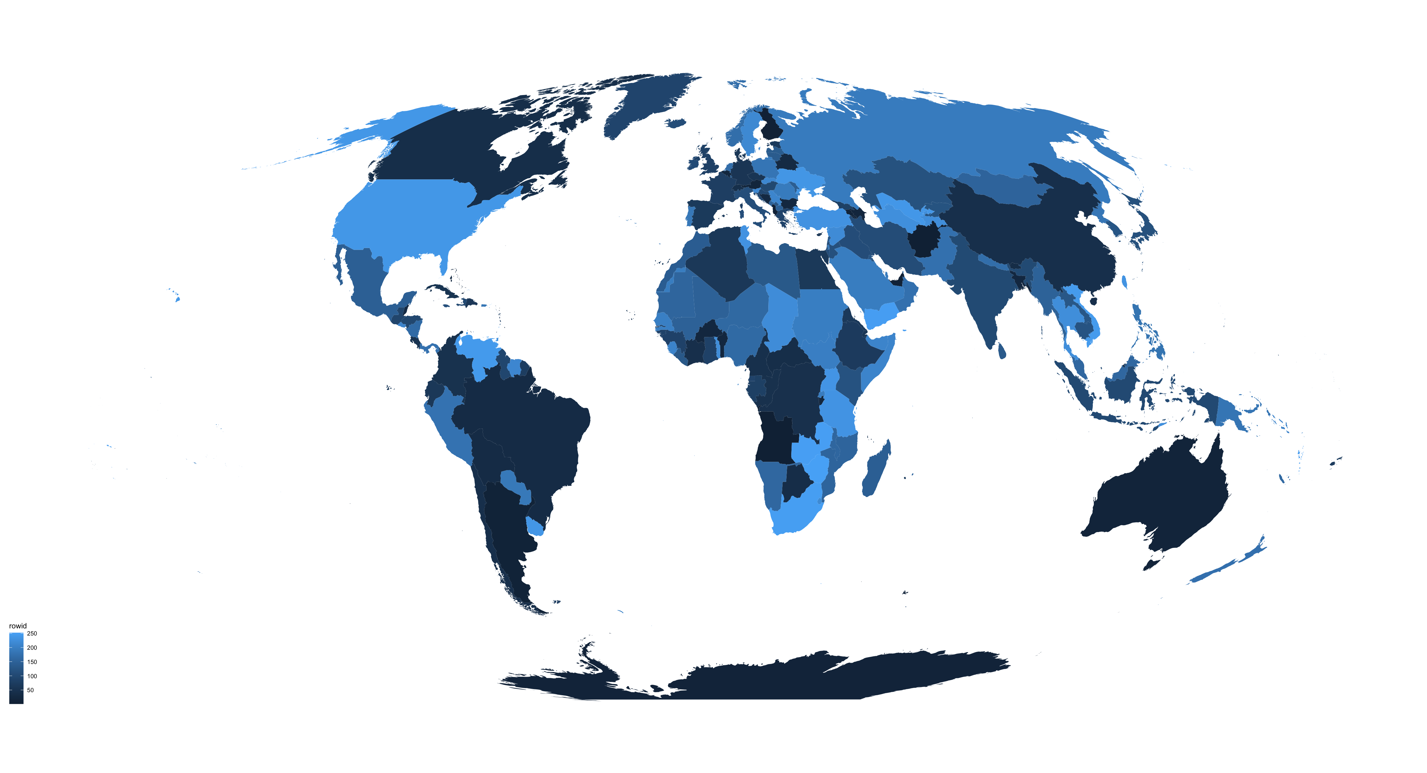
Explanation
To make a map using geom_map() you’ll need two datasets: one that includes the map data (country borders), and another one on how to colour in each area.
I tried doing data = NULL or fill = "grey" to make all countries the same colour, but couldn’t get that to work.
So I’m creating the necessary second dataset with distinct(world_map, region) which is a list of every country from the map data.
This list of countries (=regions) is the first argument to ggplot(), the world_map data goes inside geom_map(). expand_limits() are essential as otherwise you will not see anything.
library(tidyverse)

# Load map data
world_map = map_data("world")

distinct(world_map, region) %>%
  ggplot(aes(map_id = region)) +
  geom_map(map = world_map) +
  expand_limits(x = world_map$long, y = world_map$lat)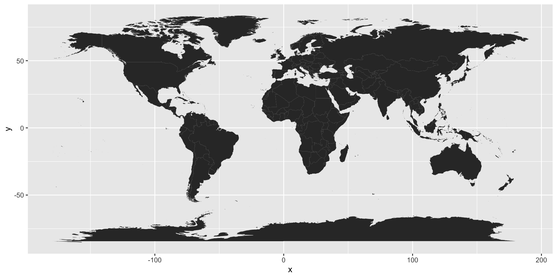
Equal area projection
Global maps that do not use an equal area projection are a huge pet peeve of mine. The above map is not ‘equal-area’ and the closer to the equator an area is the more diminished it is.
Let’s just plot Greenland and Algeria for example:
tibble(region = c("Greenland", "Algeria")) %>%
  ggplot(aes(map_id = region)) +
  geom_map(map = world_map) +
  expand_limits(x = world_map$long, y = world_map$lat)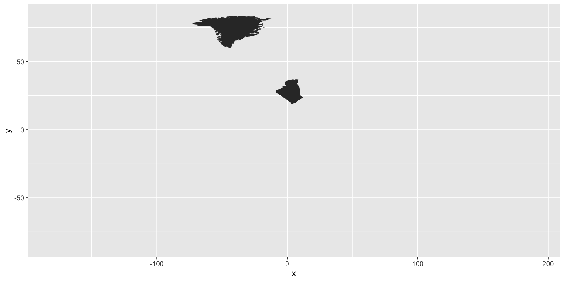
In reality, Algeria is bigger than Greenland: 2.4 million km2 vs 2.2 million km2!
Therefore, I always use an equal-area projection such as Mollweide:
library(tidyverse)

# Load map data
world_map = map_data("world")

distinct(world_map, region) %>%
  ggplot(aes(map_id = region)) +
  geom_map(map = world_map) +
  expand_limits(x = world_map$long, y = world_map$lat) +
  coord_map("moll")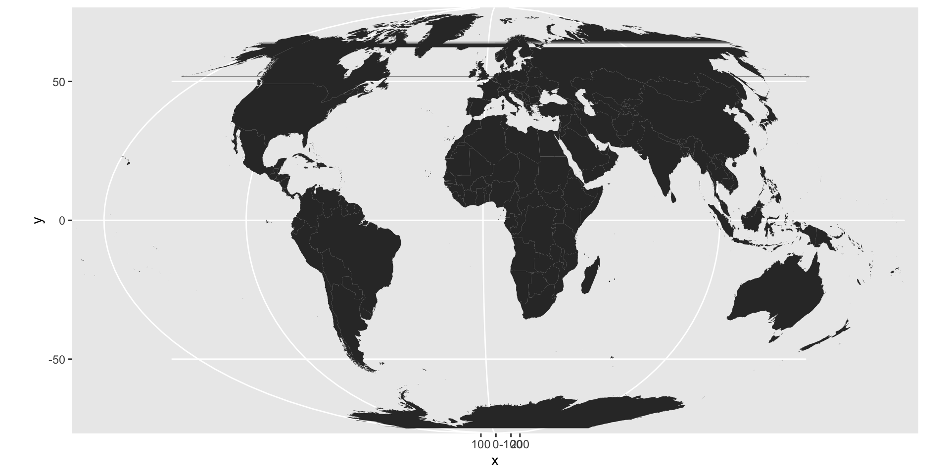
But then we get those weird lines in the Northern Hemisphere. That’s because parts of the US and Russia extend across the 180th meridian. And since geom_map() is connecting each area with itself it then draws these lines across the globe.
A simple fix I’ve found is to remove map data that has a longitude greater than 180 degrees:
library(tidyverse)
library(ggthemes)

world_map = map_data("world") %>%
  filter(! long > 180)

countries = world_map %>%
  distinct(region) %>%
  rowid_to_column()

countries %>%
  ggplot(aes(fill = rowid, map_id = region)) +
  geom_map(map = world_map) +
  expand_limits(x = world_map$long, y = world_map$lat) +
  coord_map("moll") +
  theme_map()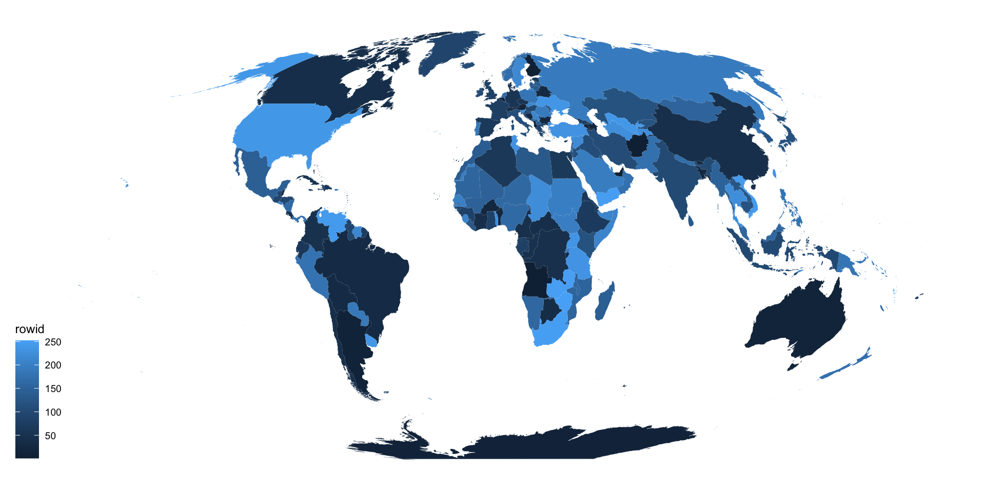
I’ve also thrown in theme_map() from library(ggthemes), put the coutry list which I made with distinct() into a separate object, and added in fill = rowid for some colour.
This is useful as I’m generally plotting chloropleths so I want a tibble with values for each country that I can join with whatever data I have for each country (e.g., student numbers, population, etc.).
