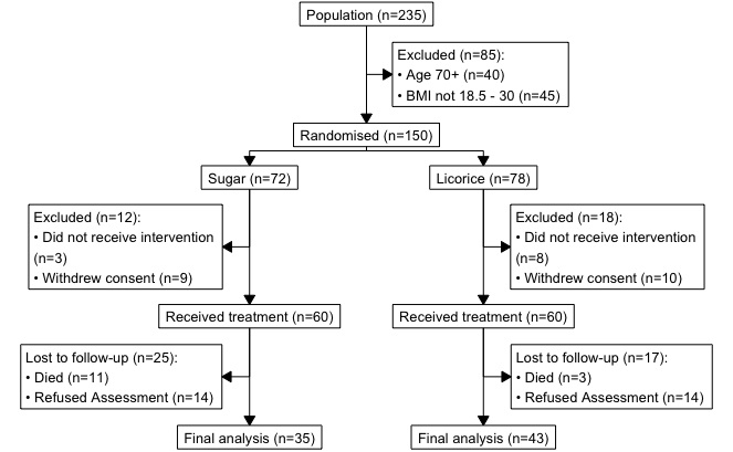
TLDR: library(consort) is a great package for creating CONSORT/patient flow diagrams in R. Thank you author Alim Dayim!
Jump to example code.
Documentation.
Introduction The easiest way to make a one-off diagram is using something with a graphical interface, such as Power Point, Omnigraffle, or Lucidchart, just to name a few.
If, however, you need something that updates automatically based on the underlying dataset changing, then a programmatical solution using R is possible.
What is Quarto? Prerequisites 1. Create a new Quarto website project Troubleshooting 2. Edit your Quarto website 3. Add a page to your website 4. Add R code to your website 5. Serve your website using Netlify Optional: If want to keep the site for longer than 1h 6. Update your website Optional advanced: automatic deploys via GitHub I’ve put together a quick ‘getting started with Quarto and Netlify and GitHub (optional) workshop’.
The HealthyR Advent Calendar 2022 was a series of 24 R tips I shared on Twitter last December
It is based on “R for Health Data Science” by Harrison and Pius. Use JKL20 for 20% off, including free worldwide shipping.
Here’s a selection of the most popular ones, all 24 can be fount at this website: https://healthyradvent.netlify.app/
More information about HealthyR, including the book and freely available resources can be found at: https://healthyr.
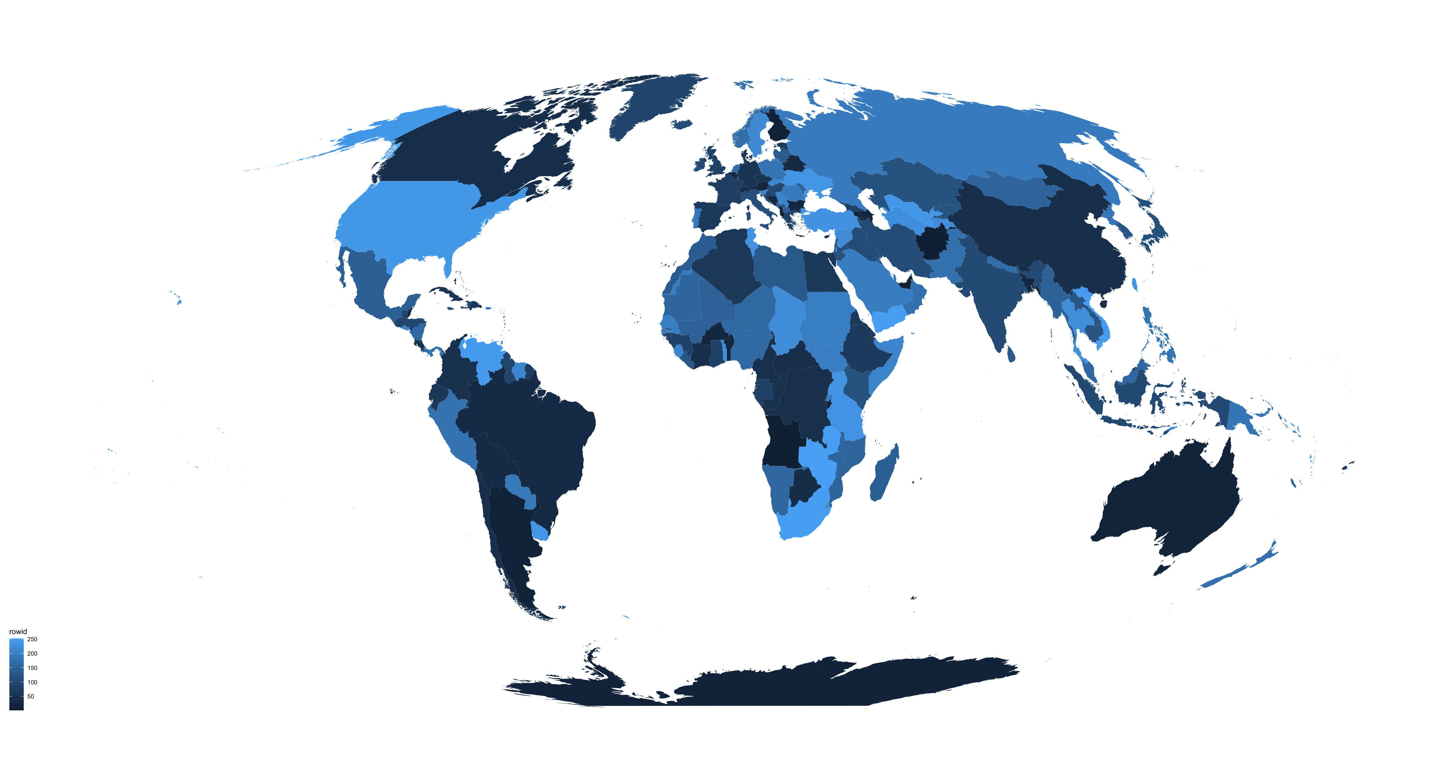
There are several different ways to make maps in R, and I always have to look it up and figure this out again from previous examples that I’ve used. Today I had another look at what’s currently possible and what’s an easy way of making a world map in ggplot2 that doesn’t require fetching data from various places.
TLDR: Copy this code to plot a world map using the tidyverse:
There’s some explanation on what reshaping data in R means, why we do it, as well as the history, e.g., melt() vs gather() vs pivot_longer() in a previous post: New intuitive ways for reshaping data in R
That post shows how to reshape a single variable that had been recorded/entered across multiple different columns. But if multiple different variables are recorded over multiple different columns, then this is what you might want to do:
NA - Not Available/Not applicable is R’s way of denoting empty or missing values. When doing comparisons - such as equal to, greater than, etc. - extra care and thought needs to go into how missing values (NAs) are handled. More explanations about this can be found in the Chapter 2: R basics of our book that is freely available at the HealthyR website
This post lists a couple of different ways of keeping or discarding rows based on how important the variables with missing values are to you.
TLDR: You can teach R on people’s own laptops without having them install anything or require an internet connection.
Members of the Surgical Informatics team in Ghana, 2019. More information: surgicalinformatics.org
Introduction Running R programming courses on people’s own laptops is a pain, especially as we use a lot of very useful extensions that actually make learning and using R much easier and more fun. But long installation instructions can be very off-putting for complete beginners, and people can be discouraged to learn programming if installation hurdles invoke their imposter syndrome.