
Flow diagrams using the consort package in R
TLDR: library(consort) is a great package for creating CONSORT/patient flow diagrams in R. Thank you author Alim Dayim!
Introduction
The easiest way to make a one-off diagram is using something with a graphical interface, such as Power Point, Omnigraffle, or Lucidchart, just to name a few.
If, however, you need something that updates automatically based on the underlying dataset changing, then a programmatical solution using R is possible.
Quarto (= new R Markdown) supports two different packages for making diagrams. These can be used to make a wide range of different ones. If, however, what you’re after is a standard CONSORT/patient inclusion flow diagram, then library(consort) makes this very straightforward.
The Licorice Gargle Dataset
These are data from a study by Ruetzler et al. ‘A Randomized, Double-Blind Comparison of Licorice Versus Sugar-Water Gargle for Prevention of Postoperative Sore Throat and Postextubation Coughing’. Anesth Analg 2013; 117: 614 – 21.
Postoperative sore throat is a common and annoying complication of endotracheal intubation. This study tested the hypothesis that gargling with licorice solution immediately before induction of anesthesia prevents sore throat and postextubation coughing in patients intubated with double-lumen tubes.
Data preparation
Data dictionary: https://higgi13425.github.io/medicaldata/reference/licorice_gargle.html
The publicly available dataset only includes final analysis-ready/complete patients. To demonstrate the making of a consort diagram we’ve randomly created three new variables of exclusions:
- eligibility
- age > 70 years
- BMI outwith 18.5 - 30
- intervention
- did not receive intervention
- withdrew consent
- lost to follow up
- died
- refused assessment
library(tidyverse)
library(medicaldata)

licodata = medicaldata::licorice_gargle %>%
  rowid_to_column("patient_id") %>%
  # make treatment var from 0,1 to factor
  mutate(randomisation = treat %>%
           factor() %>%
           fct_recode("Sugar"    = "0",
                      "Licorice" = "1")) %>%
  # assess eligigibility
  mutate(eligibility = case_when(preOp_age > 70 ~ "Age 70+",
                                 ! between(preOp_calcBMI, 18.5, 30) ~ "BMI not 18.5 - 30",
                                 .default = NA),
         # randomly generate intervention failed and lost to follow up variables
         intervention = sample(c("Did not receive intervention", "Withdrew consent",NA),
                               size = 235,
                               replace = TRUE,
                               prob = c(0.1, 0.1, 0.9)),
         followup = sample(c("Died", "Refused Assessment", NA),
                           size = 235,
                           replace = TRUE,
                           prob = c(0.1, 0.2, 0.7))) %>%
  mutate(randomisation = if_else(is.na(eligibility), randomisation, NA)) %>%
  mutate(intervention = if_else(is.na(eligibility), intervention, NA)) %>%
  mutate(followup = if_else(is.na(intervention), followup, NA))
CONSORT (Consolidated Standards of Reporting Trials) diagram
library(consort)

p_cons = consort_plot(licodata,
             order = list(patient_id    = "Population",
                          eligibility   = "Excluded",
                          randomisation = "Randomised",
                          intervention  = "Excluded",
                          patient_id    = "Received treatment",
                          followup      = "Lost to follow-up",
                          patient_id    = "Final analysis"),
             side_box = c("eligibility", "intervention", "followup"),
             allocation = "randomisation",
             cex = 0.8,
             text_width = 30)

p_cons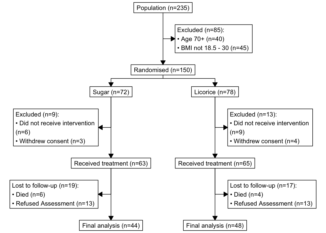
How neat is this? library(consort) calculates these numbers for us, we feed it the patient-level dataset. No need to summarise it yourself before putting in the diagram.
Notes:
Left-hand side values inside
order = list()are columns in your dataset.Right-hand side values inside
order = list()are yours to choose. For example, you can change “Population” to “Screening”, etc.I would absolutely recommend exploring your dataset using
count()or similar beforehand, so you can double check that the diagram and numbers appear as expected.In our example,
consort_plot()takes the three sets of exclusions from variableseligibility,intervention, andfollowup. If the value is anything other thanNAthe patient gets excluded,NAmean ‘no issues’ and the patient/record/row continues down the diagram.Tinker with the
cex(font size) andtext_width(wraps long strings) arguments to fit your text as well as possible.
Exporting
A few options:
Put in a Quarto or R Markdown document and export to Word/PDF/HTML.
If you’re working in an R script (so
.Rinstead of.qmdor.Rmd) you can use the Plots - Export button.If you’re working in
.qmdor.Rmdand would like to use the Plots - Export button, send your output to the Console, which in then sends it to the Plots tab: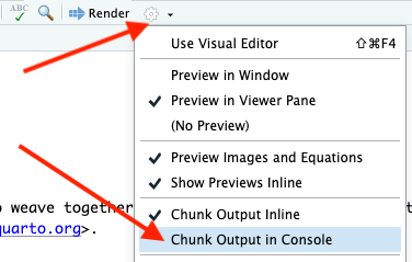 Quarto/R Markdown top cog, change to “Show Output in Console”
Use these lines to export a PDF containing just the diagram:
plot(p_cons, grViz = TRUE) |>
  DiagrammeRsvg::export_svg() |>
  charToRaw() |>
  rsvg::rsvg_pdf("consort_diagram.pdf")