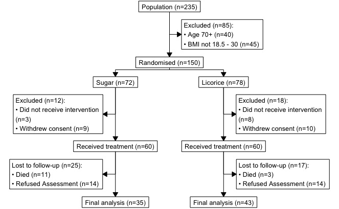
TLDR: The terms precision and accuracy should not be used interchangeably, as it is possible to be precisely wrong or roughly right. Not precise, but accurate is also known as roughly right - Figure (a). Not accurate, but precise is also known as precisely wrong - Figure (d). Being accurate means your estimates or measurements are close to ground truth. Determining accuracy can only be done via validation or calibration.

Continue reading

TLDR: For high quality images in HTML and Word outputs change your DPI setting to 200 or 300. The default DPI of figures created by R Markdown or Quarto for HTML and Word outputs is 96 (dots per inch - resolution). This may be sufficient for web purposes (HTML), but not sufficient for publishing manuscripts (Word). PDFs include vector graphics and are therefore infinite resolution. In R Markdown, DPI can be changed in the set-up chunk, by including knitr::opts_chunk$set(dpi = 300) in the set-up chunk:

Continue reading

TLDR: library(consort) is a great package for creating CONSORT/patient flow diagrams in R. Thank you author Alim Dayim! Jump to example code. Documentation. Introduction The easiest way to make a one-off diagram is using something with a graphical interface, such as Power Point, Omnigraffle, or Lucidchart, just to name a few. If, however, you need something that updates automatically based on the underlying dataset changing, then a programmatical solution using R is possible.

Continue reading

What is Quarto? Prerequisites 1. Create a new Quarto website project Troubleshooting 2. Edit your Quarto website 3. Add a page to your website 4. Add R code to your website 5. Serve your website using Netlify Optional: If want to keep the site for longer than 1h 6. Update your website Optional advanced: automatic deploys via GitHub I’ve put together a quick ‘getting started with Quarto and Netlify and GitHub (optional) workshop’.

Continue reading

The HealthyR Advent Calendar 2022 was a series of 24 R tips I shared on Twitter last December It is based on “R for Health Data Science” by Harrison and Pius. Use JKL20 for 20% off, including free worldwide shipping. Here’s a selection of the most popular ones, all 24 can be fount at this website: https://healthyradvent.netlify.app/ More information about HealthyR, including the book and freely available resources can be found at: https://healthyr.

Continue reading

There are several different ways to make maps in R, and I always have to look it up and figure this out again from previous examples that I’ve used. Today I had another look at what’s currently possible and what’s an easy way of making a world map in ggplot2 that doesn’t require fetching data from various places. TLDR: Copy this code to plot a world map using the tidyverse:

Continue reading

There’s some explanation on what reshaping data in R means, why we do it, as well as the history, e.g., melt() vs gather() vs pivot_longer() in a previous post: New intuitive ways for reshaping data in R That post shows how to reshape a single variable that had been recorded/entered across multiple different columns. But if multiple different variables are recorded over multiple different columns, then this is what you might want to do:

Continue reading

Author's picture

Riinu Pius (Ots)

if it aint broke, you’re outdated

Senior Data Manager

Edinburgh, UK